Menu Icons Considered Ugly
There’s a common but mistaken belief that proper user interface design requires lots of pictures and icons. In fact, it doesn’t. Many concepts and actions can be fully and best conveyed by text. While standard icons for directories and disks and the like can be helpful, custom icons for an application’s unique actions rarely are. The fact is, most icons are not self-explanatory; and if they’re not common enough to be standardized, they’re not common enough to be learned easily.
Nonetheless, many applications persist in creating pointless, incomprehensible toolbars. Icon design is hard. It is not something that just any art school graduate with mad Photoshop skills can accomplish. Icon design is about conveying an idea with pictures. not merely making a 32×32 bitmap look pretty. It’s hard enough coming up with a good icon for basic actions like cut and paste. Now try imagining one for “Analyze Module Dependencies” or “View Breakpoints”. There’s a reason Susan Kare gets the big bucks.
Lately, this trend seems to have seeped into menus, where text used to rule supreme. For instance, look at this File menu from IntelliJ IDEA 6.0:
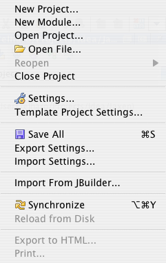
Not only do the icons add nothing to the menu items. They actually make the menu harder to scan and read because the items are no longer left aligned.
By contrast consider this File menu from Firefox:
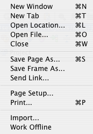
Notice how much cleaner and easier to read it is? The eye can scan straight down the left hand side looking for the item it wants. There’s a reason books, newspapers, and websites all use left aligned columns.1
Swing is partially to blame here. The Action interface encourages programmers to add icons to every action, and then displays those icons in the menus and the toolbars. However icons only belong in toolbars, not menus. Swing should be configured to never show icons in menus. I suspect Swing is merely trying to support a bad user interface design from Windows and Linux. I could be wrong, but off the top of my head I don’t think I’ve ever seen a native Mac app make this particular mistake.2 However, on Windows and Linux/Gnome it’s endemic.3
Windows gets this right too, and properly aligns the text even when some menu items have icons and some don’t. Java apps are really the odd ones out here.
But really, icons don’t belong in menus and never have. Menus are for text. Toolbars are for icons, and you shouldn’t mix the two.
1 Assuming a left to right language such as English or French, of course.
2 The Finder actually does display icons in some of its optional menus: Script, Input, and Accounts. The Input menu at least has the excuse that a potential user may not be able to read the text but can pick a flag. However the Script menu has no excuse. In all three cases, the Finder misaligns the menu items.
3 I don’t use KDE, so I don’t know if it shows up there too. Anyone happen to know?

May 28th, 2007 at 6:03 am
When they speed up item identification and selection, they’re useful. I love that there are icons in the Windows “New” context menu, for example, because I recognize the icon for “text document” or “Python script” (or whatever) long before I can scan for the text. Another good example is the use of favicons in the Firefox Bookmarks menu.
When the icons don’t make items any more recognizable, then yes, they’re useless. But “icons don’t belong in menus”? No way, not as a hard-and-fast rule.
May 28th, 2007 at 6:39 am
It looks as expected on windows with the default idea look&feel: http://img527.imageshack.us/img527/6113/ideaia3.png
The fact that it looks ugly on the mac meens only that something in the chain of java-swing-mac is broken. java-swing-windows just works somehow.
May 28th, 2007 at 8:06 am
I always thought the icons were there as a mnemonic so you can skip the menu pulldown next time and click the icon on the bar. So the reason some options don’t have icons is because they don’t have corresponding icons on the bar.
It’s the same idea as putting keystroke combos next to the menu options. The only thing more helpful than that is IDEA’s KeyPromoter plugin, which tells you the keyboard action for the item you just clicked (if there’s one available).
May 28th, 2007 at 9:31 am
The JIDE component library fixes the alignment issue with icons in menus, now that the core of it is open source, I wonder if that’s available to everybody now.
Netbeans also aligns them.
Also in the new Swing App Framework, there’s an easy way to declare text and icon properties to actions. And when you add them to a menu now you can easily remove the icon via a properties file. So you can add the same action on a toolbar with defaults, and add it to a menu and customize it a bit (no icon for example).
I think icons in menus are not a bad idea, simply because if they are indeed common actions that you perform it lets you keep the association between the command and it’s graphical symbol.
May 28th, 2007 at 10:24 am
The Finder’s Go menu is the worst offender.
May 28th, 2007 at 11:37 am
No, I think you’re missing something. Icons on Menu drop-downs are VERY USEFUL, but only when the icon is used to make an explicit visual connection between a menu option and a corresponding toolbar button. It’s supposed to work like this: File->Open gets the folder icon because there is a toolbar button with the same folder icon that, when pressed, invokes the file open dialog.
The problem of visual clutter and consequential user confusion occurs when developers forget (or don’t realise) the reason for the menu icons, and just use random images. I’m not saying it is a problem; I’m saying the problem is not what you say it is.
ASIDE: In my opinion, the drawing of links between drop-down menu options and toolbar buttons was a great step forward in usability. Unfortunately, it seemed to lead to the trend (in Microsoft Office, for example) to blur the functional distinction between menus and toolbars so that you can’t really tell which is which. I think that was a mistake. And let’s not even mention the Office 2007 ribbon. What a piece of crap that is. Sorry.
May 28th, 2007 at 11:39 am
O-kay, very late to the party I see. I could have just written, “What Chris Winters said”. Sorry ’bout that.
May 28th, 2007 at 2:56 pm
KDE uses icons in menus too, but (of course) it places the text always aligned both if there is or there is not an icon for that entry. And sorry, but I have to disagree with you. I find icons extremely useful, not only in menus but specially in the K Menu. I don’t have to read the text when I browse the menus. I just identify the shapes and colors of the set icon+name.
May 28th, 2007 at 5:03 pm
Icons are useless, people navigate by item position (that’s why adaptive interfaces suck). So are toolbars. See http://tinyurl.com/yukq6f and http://tinyurl.com/yunhfc.
May 28th, 2007 at 5:05 pm
The second link was broken: http://tinyurl.com/2egu5v
May 29th, 2007 at 2:42 am
I’ve seen icons that are really hopeless. E.g. Powerbuilder had a dinner table for their table editor and an axe with dripping blood for the execute action! I general however, I find them useful, because 1) icons indicate which actions are most common, 2) tell which I may expect to find in a toolbar and 3) provide the mnemonic that lets me recall the action when I do find it in the toolbar. You shouldn’t dismiss an idea in general, because some developers/designers do a bad job.
May 29th, 2007 at 10:34 am
Could the start menu be an exception to the general rule? Most apps have a well defined icon and it is indeed easier for me to scan for the firefox logo than read a list of options… On the other hand the gnome desktop I’m working off now has icons beside the first level categories (office, internet, programming) on the Applications menu that don’t aid scanning in any way…
May 29th, 2007 at 11:29 am
I am neutral on the utility of icons in menus, but I’ll second Oleg’s comment that this is yet another broken Java-on-Mac thing. On Linux, the menu text is properly aligned, and icons stick out to the left if they are provided. “Apple has optimized Java on Mac OS X to look great and perform superbly, making Mac OS X the ultimate platform for developing and deploying cross-platform Java applications.” (http://www.apple.com/macosx/features/java/)
May 29th, 2007 at 11:59 am
Hey ho. This is yet another example where the cross platform toolkits work for Windows and Linux (because most Linux stuff copies the Windows look) but not on the Mac…
If you look at Mac applications, going back many years into the 80s, there were often ‘checkmarks’ on menu items to indicate whether a feature was off or on. Generally color icons in menus were not used (or supported?). If you look at the Mac menus, there’s a fair sized gap down the left side to leave room for the checkmark. Later, support for color icons was added. Thinking this through logically, a menu item could therefore have things next to it:
[x][i] Some Item
Where [x] is the checkmark (off or on) and [i] is the icon (always there)
The cross platform toolkits I have seen usually mess this up in one of two ways:
* either you get one space, i.e. the checkmark is implemented *as* an icon, so you can have a checkmark or an icon but not both
* you get the icon in the menu text as seen above, with the horrible unreadable left alignment issues ERH mentions
I think, but I’m not at a Mac right now to check, that Cocoa may be smart enough to only allocate space in the menu for an icon if one of the items in the menu actually uses one.
It is one of those subtle little things – you have to leave space for both an icon and a checkmark, if you are going to support icons in your framework and want it to look right on the Mac. Most frameworks get it wrong.
This probably warrants a bug against Apple’s Aqua Swing Look and Feel.
May 29th, 2007 at 3:42 pm
> Menus are for text. Toolbars are for icons, and you shouldn’t mix the two.
Or, perhaps both have run their course — today’s applications have thousands of functions, not hundreds, and these elements simply don’t scale.
http://www.codinghorror.com/blog/archives/000724.html
For simpler apps, menus and toolbars might be appropriate. But I think the web points to an alternative method of interaction that’s even better than menus and toolbars (and it avoids the awful, awful, convention of double-clicking).
http://www.codinghorror.com/blog/archives/000397.html
May 30th, 2007 at 8:41 am
Wow, I actually think the menu icons are great and very usable. It allows the most important actions to stand out and easily be recognized. That as well as linking it to the toolbar actions.
I’m all for the simplicity of text, but *everything* doesn’t have to be text.
May 30th, 2007 at 1:06 pm
I abviously need to reconsider the sample for Gaia Ajax Widgets Menu control…!
http://ajaxwidgets.com/AllControlsSamples/Ajax-Menu.aspx
Not only do they have Icons, they have the biggest icons available in (probably) any Ajax Menu system available on the planet… 😉
🙂
.t
May 31st, 2007 at 12:12 am
Thomas–no need to reconsider. All you have to do is to make sure they look like crap on the Mac 🙂
June 1st, 2007 at 2:50 pm
Actually your example from IDEA seems to contradict your post. It seems a well done menu with *few* icons. Please note that the icons used are quite generic and/or self-explanatory. Thus, using IDEA for the first time, everyone will find the open / save or settings menu-item in a microsecond. I don’t think you get faster with *reading* menus.
But overall you are right: having a menu full of icons confuses the user since most of them are new not quite intuitive.
This I don’t think “Menu Icons are Ugly” but “Overuse of menu icons make ugly menus”.
June 1st, 2007 at 8:43 pm
@Elliotte
Firefox does feature icons in at least one of its menus, the bookmarks menu.
@Jeff
The jury is out on the Office 2007 UI, there are so many mixed opinions on the ribbon. When it comes to text and overuse of icons, I think it can lead to an even more overloaded confusion of icons, button menus and text all in different sizes at the same time.
@Thomas
Wow, those are huge. BTW, these AJAX interfaces are really a mess.
* A floating window with no good indication that its a window
* Menus that try to look like desktop menubars but don’t
* Menus with submenus but no visual indication telling you they have submenus
* Menus that can’t be navigated properly via the keyboard
* You can right click on the menus and get a context menu that has nothing to do with the menu
* Menus that auto show, getting in the way of your work
June 4th, 2007 at 6:10 am
My problem with icons to describe actions has always been the cognitive detach of trying to use an image of a thing (a diskette [how quaint!], a folder, a globe) to describe an action (saving a file, browsing, downloading content from the internet). I think this is one of the reasons why, as you say, icons are almost never sufficiently self-explanatory, and the small size required to make such an icon palatable in a menu item makes things even worse.
I wonder if Scott McCloud would have any ideas about the semiotics of representing action graphically? Can we learn something from comics? Maybe not — that format has the advantage of being able to juxtapose graphics and create a passage of time between them, which can implicitly represent action… but that’s probably not very practical for icons.
June 8th, 2007 at 2:42 am
I don’t find it ugly, some actions can open a panel with a specific icon,
retreiving the same icon inside the menu seems logical. Also, icon is
better for eyes for retreiving the right action fastly, and this is also important
when the action is shared with another usage context like a toolbar.
Some samples from Editix :
http://www.editix.com/features/images/xmleditor9.png
http://www.editix.com/features/images/xmleditor8.png
http://www.editix.com/features/images/xmleditor6.png
June 13th, 2007 at 11:16 am
About icons in menus:
It is only a point of view to interface design. I am sure, there are many adherents of the completely opposite approach.
About Swing API, Actions, menus and icons:
The current Swing API allows to disable icons of menu items even if they were created with Actions. We have a good example of such code in the Swing tutorial: How to Use Actions. See ActionDemo.java. There are toolbar and menu, which are created with the same actions. Toolbar buttons have icons, but menu items don’t.
There is the code, which creates the menu:
        Action[] actions = {leftAction, middleAction, rightAction};

        for (int i = 0; i

menuItem.setIcon(null) is sufficient to disable icons.
June 13th, 2007 at 11:18 am
It seems that my previous comment is truncated. There is the final part:
There is the code, which creates the menu:
        Action[] actions = {leftAction, middleAction, rightAction};

        for (int i = 0; i

menuItem.setIcon(null) is sufficient to disable icons.
June 13th, 2007 at 11:21 am
One more attempt:
There is the code, which creates the menu:
        Action[] actions = {leftAction, middleAction, rightAction};

        for (int i = 0; i < actions.length; i++) {

            menuItem = new JMenuItem(actions[i]);

            menuItem.setIcon(null); //arbitrarily chose not to use icon

            mainMenu.add(menuItem);

        }
menuItem.setIcon(null) is sufficient to disable icons.
June 13th, 2007 at 11:25 am
I cannot post the code. However I just want to say that menuItem.setIcon(null) is sufficient to disable icons.
June 22nd, 2007 at 12:27 pm
The new RFE #6572890 is filled
it might take a couple of days for this link to be available
Thanks
alexp
July 9th, 2007 at 1:59 am
i side with menu icons = ugly
i am lifetime artist -> graphic designer -> web designer/developer. when i look at those little abstract icons, especially in a group, my mind is overwhelmed by the visual data. they do not give me instant recognition of an action whatsoever — it’s like static.
as a visual person, the most important thing to me is visual consistency — so that i can scan a list quickly and smoothly. in seeming contradiction, when i’m working, and i’m thinking of my next action, i think of the words instead of some mostly-arbitrary little picture (pictures match objects, words match verbs).
icons in menus break that ‘consistent left-side scanability’, no longer allowing: “The eye [to] scan straight down the left hand side looking for the item it wants” — agreed!
additionally, in applications such as firefox with disparate contributors, the icons are very dissimilar — and that, for me, is a jarring inconsistency that breaks the smooth flow of my menu usage to the point of frustration.
i agree that the Gimp screenshot above is a good example of a satisfactory use of menu items with and without icons — but i still prefer zero icons in menus.
in fact, i came across this blog during a somewhat frantic/determined search to see how to rid my menus of such good-for-nothing visual garbage.
“But really, icons don’t belong in menus and never have. Menus are for text. Toolbars are for icons, and you shouldn’t mix the two.” — i wish i said that…
final note: icons on a desktop are great for object/program recognition. and some are even attractive little pieces of art in themselves…
now… on to learn how to get of those pesky little…
July 13th, 2007 at 8:04 am
Here’s a screenshot of a KDE menu: http://ernstdehaan.com/kde-menu.png
July 16th, 2007 at 3:13 am
loads of apps in osx have icons in menu items, even safari! mind you, IMHO menu’s (along with dialogs) are one of the weakest bits of OSX and the Universal Access functionality doesn’t particular address those fundamental weaknesses.
October 1st, 2007 at 6:12 am
Seems OpenOffice has this problem as well. I’ve filed a bug on that.
January 2nd, 2008 at 5:48 pm
Icons in the menu do have a function: they provide a pedagogic vector, so users can recognise the same icon on the toolbar.
It follows, therefore, that the only icons that should appear in a menu are the ones that appear on a toolbar. And since the ones that appear on a (properly designed) toolbar are likely only the frequent-by-many tasks, this means that on the menu only the frequently-used commands would have an icon.
That’s the theory. Of course, then there’s the Microsoft Office ribbon, wihch has thrown a wrench into that whole theory.
August 21st, 2008 at 7:22 pm
You know, I use IntelliJ every day, and yes, I have most of those icons memorized, and I *don’t* have the menu location of everything memorized. But, as a result, I only find the icons useful for finding things whose control key I knew yesterday, or which were on the toolbar I just closed.
But the most important function they serve is to let me know that something interesting might be there.
There’s a very useful activity you can do in a library – wandering up and down shelves looking for books that might be interesting. I use IntellJ’s interface that way sometimes.
OK – unscientific experiment. I happen to have IntelliJ open right now. I’ll see how many of the icons showing I can identify. I knew what 33 of the 38 were. Interestingly, I knew some pretty obscure ones like ‘show structure’, while missing ‘search’ and ‘replace’.
Speaking of stupid icons, why does every program have the toolbar for the file actions open by default? For all the time I spend watching experienced power users use computers, I’ve *NEVER* seen anyone use those icons. Nor have I seen an inexperienced user use them.
December 1st, 2008 at 10:56 pm
If there are to be icons in menus, I think we should be allowed to use them to the extreme, i.e. to get rid of the text. Can anyone tell me how to do so in gnome?
April 23rd, 2010 at 4:40 pm
[…] interesting discussion of icons on menus […]