Settop Boxes: It’s Not Just Computer UIs that Suck
I recently succeeded in switching back to Cablevision after a few years with DirecTV (and it only took three appointments!). Thus I find myself learning a new interface for something that is supposed to be a TV, and it’s clear that cable folks have no more clue about human interface design than most PC software companies do.
First a look backwards. I’m not sure I can fairly judge DirecTV’s user interface since I’ve grown accustomed to it over the last few years. However there are still some glaring problems. For instance, why does flipping through the channels while the program guide is visible frequently pause while “Acquiring data from satellite”? Haven’t these folks ever heard of caching? Is it that hard to hold on to 24 hours worth of program data so I don’t have to constantly wait for the satellite to come around to the channel I’m flipping to?
Second, has anyone over there ever heard of indirection? Is there some reason channel 5 is on channel 882? Would it be so hard to put channel 5 on, I don’t know, maybe channel 5? (Cablevision actually gets this much right.) What’s truly galling about this is I know someone over there at DirecTV does have a clue. It took serious clue to put the DirecTV advertising channel at 500, right before HBO and the other premium channels on 501. Someone knows enough about how human brains and fingers work to realize that we were much more likely to ckick over to 500 and start flipping from there than to start at 501. That’s a very subtle distinction, and I’m sure it’s no accident. If only this person (whoever they are) could have been convinced to use their powers for good and not for evil.
And don’t even get me started on the remote. For the four years we’ve had Directv my wife remains persistently confused by it because it is very easy to switch it from satellite box to TV or VCR mode, in which case none of the usual buttons work. There is no visible evidence which mode the remote is in. You just have to press a button and hope. The saving grace is that none of the modes except satellite actually work. If the “universal” remote were actually capable of controlling the TV or VCR or DVD, then we’d be accidentally turning those on or off all the time.
But enough about the past. What about the future. Is Cablevision any better? Not really. It does some things better, but it does other things worse. The channel guide is hidden two levels deep. There’s no way my wife’s ever going to find that. If she does find it, it doesn’t provide as much information as the Directv guide does; just the name of the program, no description. Like the DirecTV guide though it does provide lots of menu items for services we don’t subscribe to, and that just present error messages if you select them. Why are these on the screen in the first place?
And programming the remote. Was this designed by Edward Elgar? Here I have a great big 19″ high definition monitor designed to tell me exactly what’s going on, and how does the remote tell me what’s happening? By blinking one light. Here’s a direct quote from the instructions:
The iO button will blink the number of times indicating the number of each digit of the code number. Each digit is separated by a 1 second interval of the iO button being turned off.
Even ham radio operators don’t have to learn Morse code any more. Heck, Morse code would be an improvement over this insanity.
And how do you change the settings on the remote? Maybe you press the clearly labelled Settings button? Of course not! Instead you hold the TV and SEL buttons for three seconds until the iO button starts blinking. At least the instructions do refer to the SEL button. DirecTV had a distressing habit of referring to buttons like cancel or + that could be found nowhere on the actual remote.
On the other hand the channel guide does tell me to, “Press EXIT for more info.” I suppose pressing the INFO that’s directly to the left of the EXIT button would have been wrong?
I’d like to show you some screen shots of all this, but for some reason the channel guide only seems to work on my TV. The cable box hooked up to my Mac is just constantly loading:
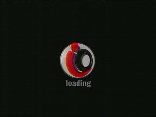
OK. Fixed that. Turns out the box needed to be rebooted (another bad habit picked up from the computer world. “Have you tried turning it on and off again?”) Here’s the first screen you see when you ask for the channel guide:
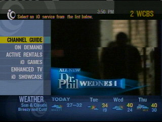
The issue is that I always want the channel guide. I doubt I’ll ever want any of the other six options; or, if I do, I’ll want them a lot less often. Why couldn’t there be an obvious button to take me straight to the channel guide like DirecTV has? Also worth noting: the text fonts all look like circa-1988 bitmaps scaled several powers too large. I know not even an HDTV has that high a resolution, but on a color screen you shouldn’t have obvious jaggies. I mean really, when’s the last time you even heard the word “jaggie”? Younger readers may not even remember what those are. (Note: the jaggies are not so apparent in the scaled down screen shots here, but on my actual wide screen HDTV they’re incredibly obvious.)
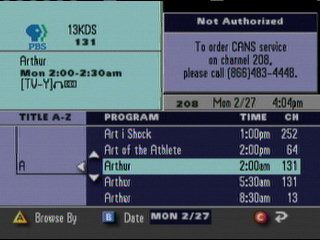
I like being able to browse by title and theme. However, is it really necessary to show me every variant of a show within a 24 hour window? I don’t even want to think about what this means for Law & Order. Couldn’t you just show me what’s playing now and in the near future?
There are a few nice touches. When you’re flipping through the channels, the channel you’re on is clearly indicated. If you stop on the channel it vanishes after a couple of seconds:
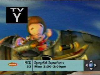
(For the moment I’ll pretend not to notice that it’s actually showing the wrong show. At least it got the network right.)
Now if we could just convince the networks to stop putting annoying logos in the corner.
Please Steve. Give us something better.
March 22nd, 2006 at 1:00 pm
Well said. I wonder about these things every time I turn my T.V. on (I’m with Rogers cable (rogers.ca) up in Canada).
imo, it’s one of the cons about closed-source models – we’re slaves to what the providers decide to give us. And it’s only going to get worse as more and more “content protection/DRM” is pushed down our throats.
Imagine if you could tweak the UI with your own modifications, or download others modifications from the web (ideally, directly from your T.V.). Many people would benefit from better UIs more suited to their tastes.
Why can’t I have the channel lineup filter out channels I don’t currently get (i.e. I’m not subscribed) automatically? Why can’t I move channels around (change the order they appear in on the channel menu) to better suit me, so that the HD channels show up in a more convenient location (as opposed to being stuck up in some obscure channel range. Why are XXX channels scattered all through the channel lineup? They should be easily filtered so as to not appear at all, and they should be listed together rather than scattered so widely across channel lineup.
Even better, let me put together my own cable box rather than your own (which the providers are doing their best to prevent for DRM purposes (DSCP?)). Then I can put a decent hard disk in my PVR rather than your puny one. Not to mention that my providers cable box/PVR is plagued with bugs.
Opening these bizarre idiotic interfaces to modification by the public would be a big step in the right direction. Please, providers, provde the content, but let me have some control over how I interact with it. I know it goes against your core principle of control over the consumer, but really. This idiocy has to stop.