Need more proof that monopolies are bad business? Just try to pay a utility bill online sometime. I have just gotten through attempting to pay my cable, gas, and electric bills online. Exactly none of them offered what I would consider a minimally competent site. The exact problems varied, but there was one that was common across the three. Every single one required registration before they’d take my money:

By contrast, non-monopoly sites like Office Depot have long since learned that registration is an optional step they shouldn’t let get in the way of completing a sale. But the utility companies? Either they hire developers who are distinctly behind the state of the art, or they just don’t care because you have to pay them, or both.
Read the rest of this entry »
This entry was posted
on Sunday, December 21st, 2008 at 4:22 am and is filed under User Interface.
You can follow any responses to this entry through the Atom feed.
Both comments and pings are currently closed.
I’ve just spent a couple of hours installing and exploring Ubuntu 8.04. Bottom line: better but still not yet an adequate end user system. Here are the things that absolutely must be fixed before one can plausibly recommend Ubuntu to a non-developer end user (and since Ubuntu is the best desktop Linux out there, these are things that need to be fixed before one can recommend desktop Linux). In roughly increasing order of severity:
Read the rest of this entry »
This entry was posted
on Sunday, May 25th, 2008 at 12:19 am and is filed under User Interface.
You can follow any responses to this entry through the Atom feed.
Both comments and pings are currently closed.
For the last couple of months I’ve been working on Windows as my main desktop during the workday (not my personal choice, but I can live with it.), and that’s caused me to notice a few things I haven’t noticed before, especially in contrast to the Mac style of managing windows. I’ve task switched between Mac and Windows before–for several years in the late 90s I did all my development and book writing on Windows and all my e-mail and Internet on the Mac–but this is the first time I’ve had the chance to compare the two environments with multiple monitors, and that’s made some difference in my take on matters. Practices that work well on a single monitor system don’t work as well on multimonitor system and vice versa. After playing with this for a while, I’m starting to think that the Windows approach works better for multiple, small monitors and the Mac approach works better for a single, widescreen monitor.
To summarize, here are the critical differences between the two platforms. These are worth keeping in mind when you’re designing a cross-platform application such as Firefox or Limewire, or any web site.
Read the rest of this entry »
This entry was posted
on Thursday, August 16th, 2007 at 3:27 am and is filed under Macs, User Interface.
You can follow any responses to this entry through the Atom feed.
You can make a comment or trackback from your own site.
There’s a common but mistaken belief that proper user interface design requires lots of pictures and icons. In fact, it doesn’t. Many concepts and actions can be fully and best conveyed by text. While standard icons for directories and disks and the like can be helpful, custom icons for an application’s unique actions rarely are. The fact is, most icons are not self-explanatory; and if they’re not common enough to be standardized, they’re not common enough to be learned easily.
Nonetheless, many applications persist in creating pointless, incomprehensible toolbars. Icon design is hard. It is not something that just any art school graduate with mad Photoshop skills can accomplish. Icon design is about conveying an idea with pictures. not merely making a 32×32 bitmap look pretty. It’s hard enough coming up with a good icon for basic actions like cut and paste. Now try imagining one for “Analyze Module Dependencies” or “View Breakpoints”. There’s a reason Susan Kare gets the big bucks.
Lately, this trend seems to have seeped into menus, where text used to rule supreme. For instance, look at this File menu from IntelliJ IDEA 6.0:
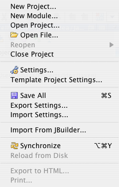
Not only do the icons add nothing to the menu items. They actually make the menu harder to scan and read because the items are no longer left aligned.
Read the rest of this entry »
This entry was posted
on Monday, May 28th, 2007 at 4:30 am and is filed under Blogroll, Macs, User Interface.
You can follow any responses to this entry through the Atom feed.
You can make a comment or trackback from your own site.
IBM’s Bill Higgins takes a very unusual way of explaining why Mac apps should look like Mac apps and Windows apps should look like Windows apps. It also explains why desktop Java failed.
I’m not sure his analogy really holds, but I’m not sure it doesn’t. His conclusions are correct, even if his reasoning and/or evidence turns out to be faulty.
He makes a good argument that SWT is the right way to design a cross-platform GUI, and Swing is the wrong way. The problem here is that empirically Swing delivers more native cross-platform apps than SWT does. When theory clashes with experience, either the theory is wrong or there are factors not accounted for in the theory. I suspect the latter here.
This entry was posted
on Friday, May 18th, 2007 at 7:51 am and is filed under User Interface.
You can follow any responses to this entry through the Atom feed.
You can make a comment or trackback from your own site.